Those in the GIS community know the power of spatial data and geospatial technology to respond to public health emergencies. The story of Dr. John Snow and his use of simple mapping of data to respond to the London Broad Street cholera epidemic of 1854 is famous. Snow is considered to be one of the founders of the modern science of epidemiology. He took statistical data and transformed it on maps into spatial information, which provided him with the actionable knowledge to remove the handle of the Broad Street public water pump.
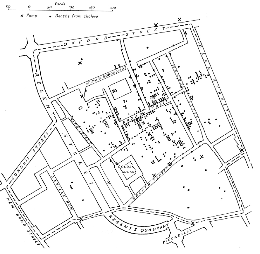
Original map by John Snow showing the clusters of cholera cases in the London epidemic of 1854. The X in Broad Street shows the location of the public water pump
My wife flew to China in early January to spend the New Year Holiday with her family and friends in Beijing and in Inner Mongolia. By the middle of the month, the emergence of a novel coronavirus, originating in Wuhan, China, became public knowledge. I have experienced the festive, week-long New Year celebrations in China before, but this year my wife reported that all was eerily quiet, as people across the country were first urged and then compelled to stay home. Streets that normally thronged with people day and night year-round were all but deserted.
I quickly discovered an excellent interactive map from Johns Hopkins University’s Center for Systems Science and Engineering (CSSE) to track the spread of 2019-nCoV (2019 novel coronavirus). Mapping 2019-nCoV is a GIS based dashboard that aggregates 2019-nCoV data from the World Health Organization, U.S. Center for Disease Control, and sources from within China. The CSSE online dashboard, Coronavirus 2019-nCoV Global Cases, provides worldwide statistical data at country and regional levels, records total cases, mortality, and people who have recovered, plus graphs that show total cases by day in both mainland China and other locations. The focus of the dashboard is an interactive map that allows drilling down into individual countries or regions across the world. The Johns Hopkins CSSE 2019-nCoV dashboard also allows download of their aggregated source data.
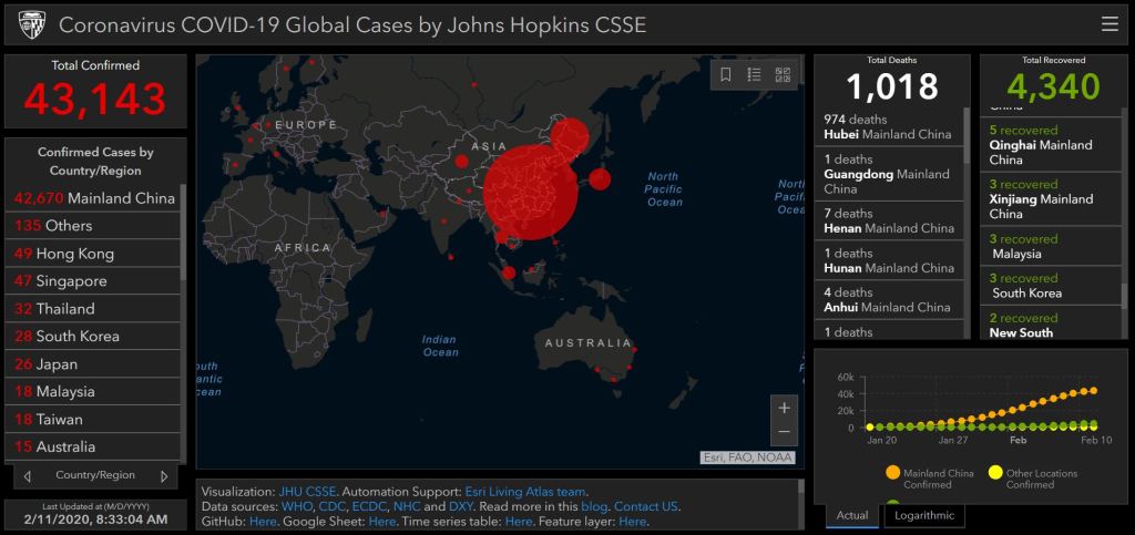
Coronavirus COVID-19 Global Cases by Johns Hopkins CSSE
As of this writing, there have been more than 43,000 confirmed 2019-nCoV cases worldwide, but just 13 in the U.S. There have been over 1000 recorded deaths worldwide, but none so far in the U.S. Three of the 13 cases in the U.S. have now recovered. Just for context, in the United States during the 2019-2020 flu season, the CDC estimates that through February 1, 2020, there have been more than 22 million flu illnesses in the U.S., with more than 210,000 hospitalizations and at least 12,000 deaths. In Washington State alone, there have been 62 confirmed flu-related deaths this season, through February 1.
For those who would like to understand Chinese data sources related to 2019-nCoV, the China Data Institute and the Global Association for Research Methods and Data Science will be presenting a free webinar on February 20 titled “An Introduction to the Data Resources on the 2019 Novel Coronavirus.” This webinar will describe how researchers from the Center for Geographical Analysis at Harvard University, the Geo-computation Center for Social Sciences at Wuhan University, RMDS Lab, and the Chinese Data Institute are working together to build a web based platform for sharing research data on 2019-nCoV.
My wife made it home safe and healthy from China last week. She was screened for symptoms in Beijing, Tokyo, and Seattle. Now she and I are on ‘voluntary’ 14-day quarantine at home, with health and symptoms monitoring by the Center for Disease Control and the Snohomish County Health District. Public Health – Seattle and King County also works to provide 2019-nCoV monitoring and services for Seattle and all the communities within King County. The science of epidemiology that Dr. John Snow launched 166 years ago in London has been mobilized across the world, from Wuhan to my home. Geographic analysis enabled by GIS technology is helping epidemiology and all humanity respond to this latest health threat.


Pingback: GIS for COVID-19 online roundtable on April 1 – KCGIS User Group special meeting | GIS & You
Pingback: GIS Day 2020 – King County GIS looks back and looks to the future | GIS & You