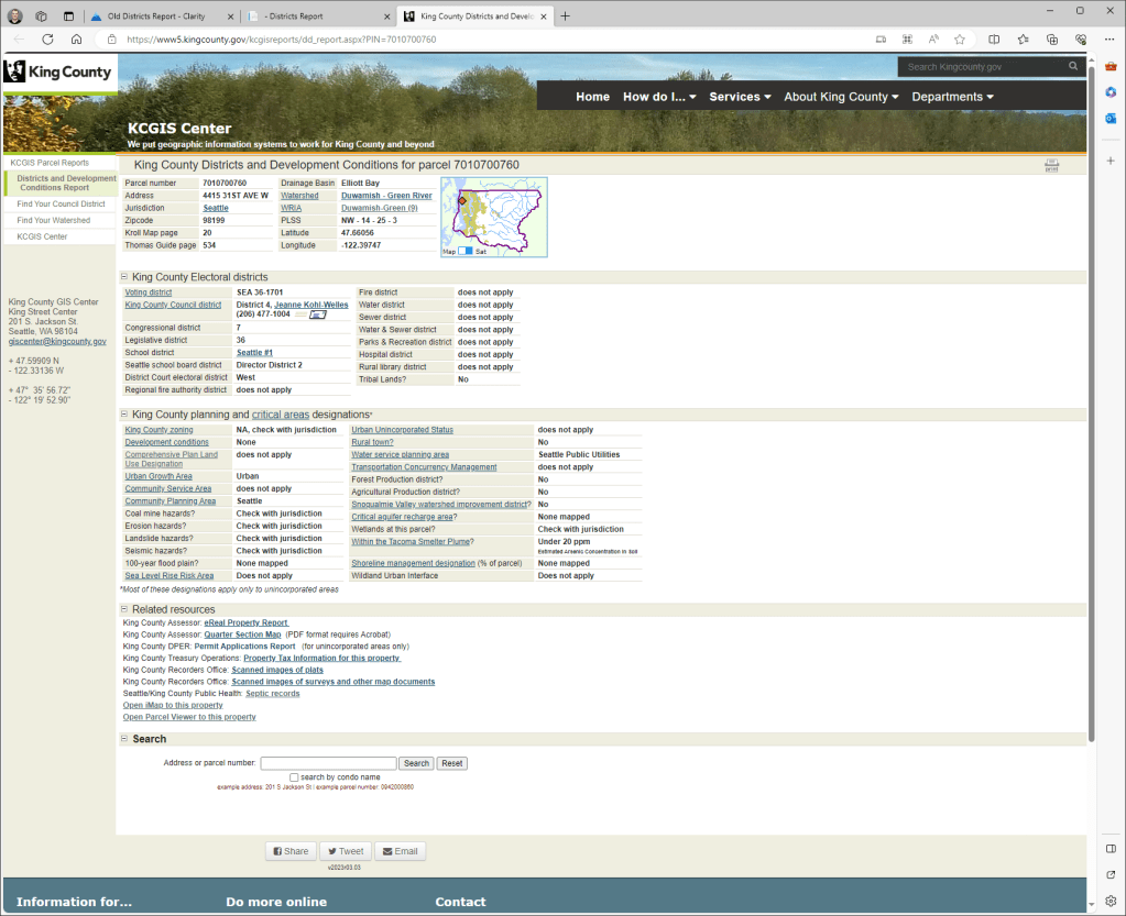
Understanding your users is one of the most difficult problems in software development. The King County GIS Center over many years has built a public reporting application known internally as the Districts and Development Conditions Report. About three months ago we began a project to modernize this web app. While upgrading the technical portions of the application was straightforward, modernizing the look and feel of the web app was complex. Fundamentally, we didn’t know who the customer was for this report.
We are all Customers
Anecdotally we knew that many departments in the County, real estate businesses, and even our families used this report to learn about parcels. Thus, everyone on the team agreed that we had a responsibility to improve the app, but we didn’t have a specific business or customer that could give a clear list of requirements or veto our changes. Part of this problem arose from the continuous improvement that this report had received over the 15 years it’s been publicly available. The first working snapshot of this report in the Internet Archive’s Way back Machine is from March of 2008. The first version of the report with the current, now old, UX appeared in August 2015.
Many different groups inside King County from the Department of Local Services to the Department of Natural Resources and Parks provided the underlying data and asked for their data to be displayed in the report in specific ways. The evidence of these partnerships is in the report itself, but the relationships that produced these updates and changes had atrophied as reorgs, layoffs, and staff turnover occurred. In the end, we were able to find a few internal customers to gather feedback from, but only after we had completed most of the work on the new Districts report and mostly finalized the UX with the support of the County’s in-house Design and Civic Engagement team.

Getting Clarity through Clarity
A tool that gave our team key insights into the user base of the Districts Report was Microsoft’s Clarity. I played with Clarity a few years ago for a personal project and found it helpful. Up until this point, the only telemetry we had was from Google Analytics, but it only provided us with a rough idea of how many people were using the report, not what they were consuming inside of it.
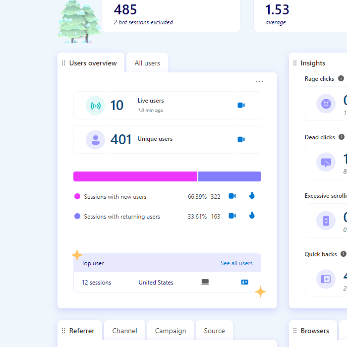
In this screenshot, you can see that about 2/3rd of the traffic are new users.
Clarity answered this question “What specifically are people doing in our app”? Starting from the dashboard in Clarity we were able to see that ~60% of users were new to the report. This is a key insight as it implies that most users are not returning King County internal users or returning business users like realtors or builders. One group of people that the old report was not optimized for was first-time users, rather it had been built almost entirely for the benefit of our organization. Now we knew how important it was to address their needs in the modernized report.
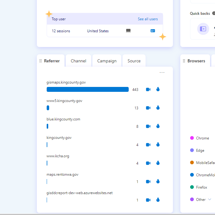
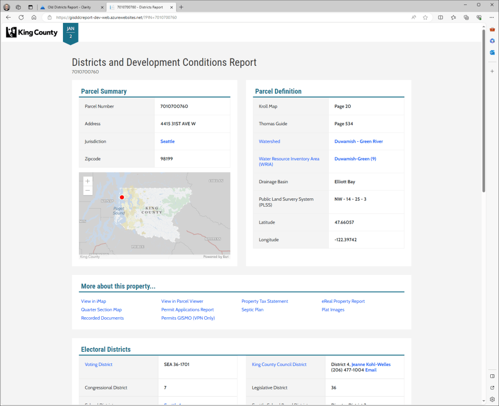
Another startling insight was that more than 90% of the traffic to the report was referred from the domain that our other GIS web apps, namely ParcelViewer and iMap live on. Less than 1% of the traffic was coming directly to this report, rather users were linked to the results for a specific parcel that they’d searched for and found on an interactive map. We’d built out multiple text-only search pages and a relatively complex autocomplete search box as that’s what existed in the old report, but now we had evidence that it wasn’t providing much value.
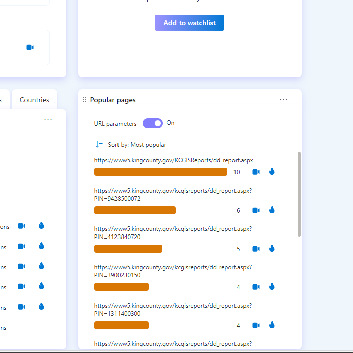
Another aspect that surprised us was that the most visited page only had a dozen views. We had expected that certain parcels, like active building projects, would have hundreds or thousands of views, but almost all parcels that were viewed had 1 to 3 three views in 7 days. I guess parcel information isn’t quite as fun for the public as we were hoping!
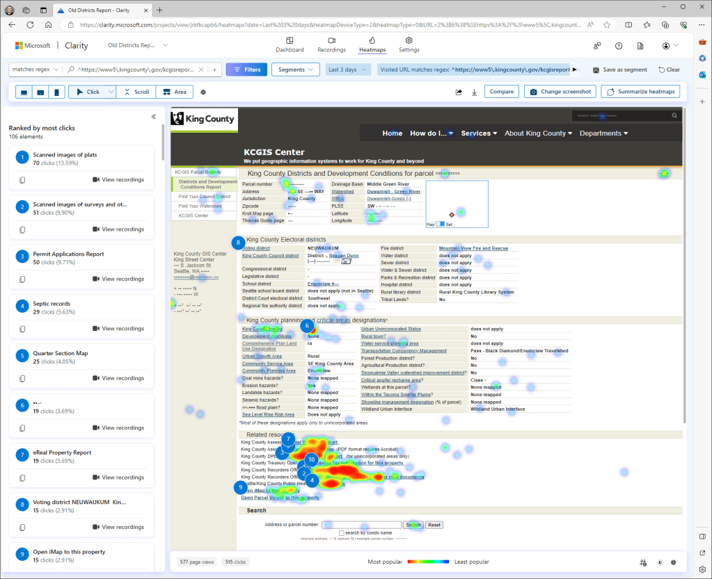
Using the heatmaps that Clarity provides, we found that the most clicked-on items on the page were the section of links to other King County apps with additional information about that specific parcel near the bottom of the page. Although users also interacted with the help links that described some of the data displayed on the page, they seemed to mostly ignore interacting with the content of the report.
They’re using it Wrong
This led us to a philosophical disagreement: should we force users to scroll over the whole report to get to the links they want, or should we move the links to the top of the page? On one side were teammates who believed that the report should show its data first and the related links after as it was meant to be a report, even if that’s not how the users treated it. I found myself on the other side arguing that we could improve the user experience by putting the links higher up on the page. In the end, we split the basic identifying information and the more detailed information by placing the related links between them. The idea is that when you arrive on the page, you can confirm that you’re in the right place before moving on to the next link or looking deeper into the details.
For our team Clarity was valuable because it reduced the scope of our work and supported our new UX ideas by giving us hard evidence about what was being used and what was being ignored in the existing app. It helped our team bridge the gap between our understanding of how people consumed our app and the reality of watching someone click through the report in a recording captured by Clarity.
We are excited for everyone to try out the new Districts and Developments report. If you are a King County employee and you like to test it out or provide feedback, please contact us. For the public, the wait will be a little longer, but we’re sure that you’ll appreciate how much quicker it is to load and how well it works on mobile devices.

About the author: Thomas Ryan is a Principal GIS Data Platforms Engineer at the King County GIS Center. Tom enjoys programming in C# and JavaScript. In his free time, Tom is an avid skier and bicyclist (depending on the weather).


