A King County policy priority is building equity and opportunity for all. King County’s pro-equity policy agenda has eight focus areas, one of which is environment and climate.
Recently I worked with the King County Solid Waste Division to help develop an ArcGIS Online web application for the equity and social justice (ESJ) assessments of the division. Solid Waste’s mission is to improve waste prevention, resource recovery, and waste disposal, with a future vision of zero waste of resources.
The ESJ application I helped to develop includes approximately a dozen census-related demographic measures, including race, language, income, and age, along with pertinent Solid Waste program-related GIS data. Development of the application began with a room of stakeholders who wanted to relate ESJ demographics to dozens of the division’s programs such as transfer stations and service areas, illegal dumping, recycling rates, capital improvement projects, and waste-hauler service areas. These datasets in a GIS-based application give Solid Waste a valuable tool to see how capital and operating projects correlate to ESJ data.
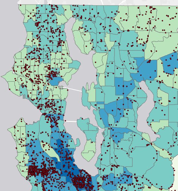
For example, staff can view each transfer station service area and see what demographics are served in that particular area with regard to race, language, age, income, etc. Additionally, Solid Waste will use the application to tailor outreach programs based on race and language variability around King County. Staff can see the highest percentages of languages for any service area and prepare programs accordingly. In the example below, staff can see illegal dumping locations in relation to the distribution of percent people of color (as mapped by census tract).

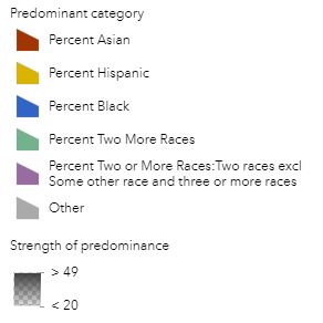
Within the application we also incorporated some ArcGIS smart mapping techniques. Predominance Mapping allows one to compare up to ten attributes within a data layer to quickly discover patterns and trends. Solid Waste staff can see which demographic attribute is highest and how predominant it is in relation to the others by the degree of color transparency. The deeper or darker the color, the more prevalent or abundant a value is. In the example below, staff can see which race category (other than white) is highest per census tract and how predominant it is (the darker the color, the higher the strength of predominance).

Solid Waste already plans to expand the application, incorporating more planning and operations data. They would like to see their transfer station truck routes in relation to public health data, such as diesel emissions, ozone concentrations, and particulate matter.
Can changing fuel types in their trucks have an effect on the areas of the county that have the highest concentrations of vehicle-emitted pollutants? How might division operations affect tree canopy coverage, traffic data, and odor complaints? Do truck routes coincide with the highest traffic spots? Where are the most odor complaints in relation to division facilities and what are the demographics of those most affected? Where are areas of greatest or least tree canopy coverage in relation to division operations?
GIS is clearly a critical tool for the Solid Waste Division to do its part in support of King County’s ESJ goals in the environment and climate focus area.


Pingback: Esri ‘shout-outs’ about three recent KCGIS projects | GIS & You