Today, we are excited to announce the availability of our new Districts and Development Conditions Report. This report is the culmination of nearly two years of work by a half dozen KCGIS Center staff. We’re proud to deliver a good experience on phones and tablets in addition to the modern look and feel that you’ve come to expect from the new kingcounty.gov.
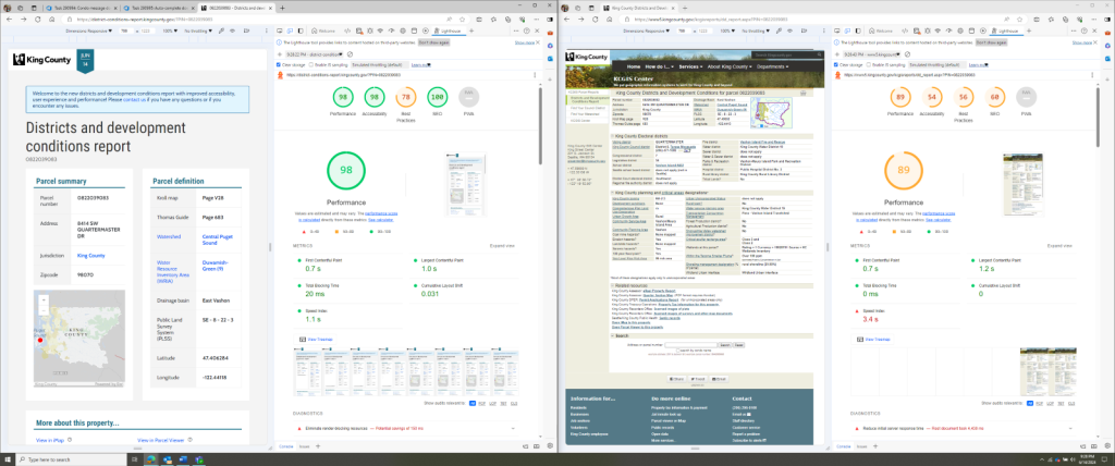
The biggest improvement is performance. On average it’s more than twice as fast to look up a parcel and in heavy traffic scenarios, it can be nearly instant. Try it out here: (Marymoor Park) 1325059001 – Districts and development conditions report (kingcounty.gov)
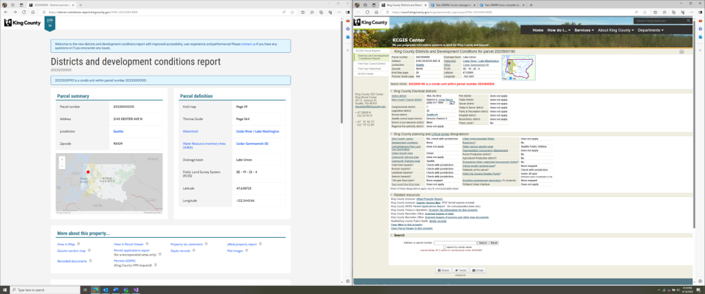
The motivation for this project was to modernize the user experience and architecture to meet King County’s current standards. The old report was also a bit slow. For certain parcels, it would take upwards of 20 seconds to load the page. Initially, we looked at improving the existing application. But our enthusiasm for continuing to invest was tempered after learning that it was written in Visual Basic on top of .NET Framework 3.5; technologies that are supported by Microsoft but will not receive future enhancements.
Over a couple weekends, I wrote a prototype that became the basis for the new Districts and Development Conditions Report. In addition to using current technologies like the C# language and .NET 8, it was hosted in Azure on a Linux server. Making the report faster was the primary goal, but I also wanted to spruce things up a bit by cloning the styling of the kingcounty.gov refresh. All this prep work was essential for when I went to give the sales pitch for this project to my coworkers, and eventually the KCGIS Center.
A New Look
One of the key tools that enabled us to make evidence-based decisions about the layout and visual design of the new report was a tool from Microsoft called Clarity. You can read about our use of that app to gather telemetry and understand the users of the existing report here: Understanding Users of Tabular GIS Data | GIS & You (gisandyou.org)
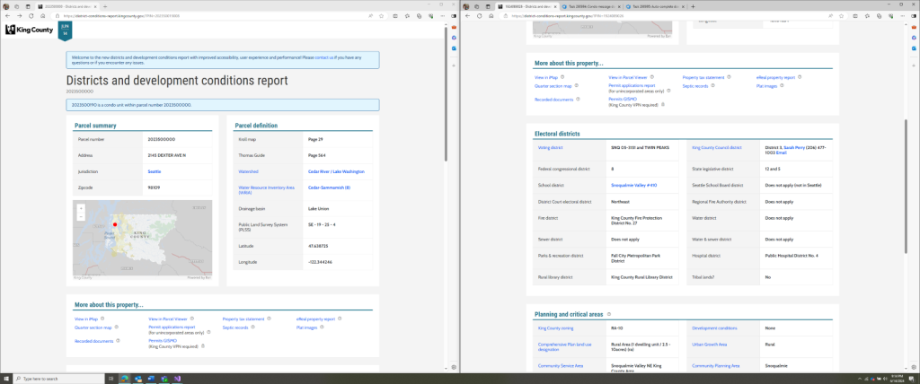
We started by wholesale cloning the King County landing page and reusing its CSS file, a customized version of the popular Bootstrap library, in the prototype. Then after a period of review and consultation with our design folks, they provided us with most of the layout in the final product. Based on a series of demos we performed and feedback that we received from staff in permitting and assessments, we increased the density of information in the layout and better prioritized what content is shown when you initially load the page. I want to thank the Design and Civic Engagement team who were instrumental in helping us to integrate the style of kingcounty.gov into our fully custom web app.
In the initial prototype, I didn’t include a map. This led to quite an internal debate, as the existing report had a small map that showed you where your parcel was in King County. There is a significant complexity and performance cost incurred by including a map in your app.
But let’s be honest, we love maps here at the KCGIS Center. You’ll see a place finding map in the new report complete with the updated King County basemap which is now delivered as vector-tiles rather than raster tiles to improve performance and quality.
Replacing the KCGISAPI
Although not visible to the users of the new Districts and Development Conditions Report, all the data shown in this app is sourced from a standalone app that provides a REST API. As part of this replacement project, we rebuilt this API using the same technologies as the report to improve its performance, reduce its scope of responsibilities, and provide interactive documentation to its consumers with a Swagger page.
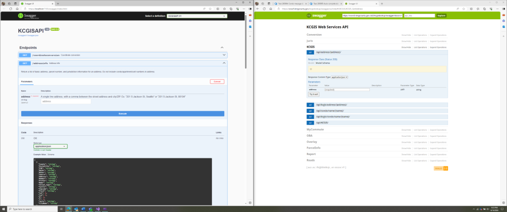
We made a concerted effort to maintain backward compatibility with the old API, and we wrote a suite of automated tests to verify that the new endpoints responded to the same queries and with the same JSON payloads as the legacy endpoints. Once we were certain that we had faithfully recreated the old API, we reviewed all the endpoints and identified their consumers. This enabled us to cut the unused endpoints and condense the responses of the remaining endpoints down to just what was required to support the new District and Development Conditions Report.
Modernizing the Architecture
The old app and the API that supported it were deployed to the same Windows Server virtual machine (VM) and hosted using the built-in Internet Information Services (IIS) webserver. When we began this project in earnest, there was a desire at the strategic level within KCIT to build new applications in a cloud-first or cloud-native way. To that end, we’re hosting a new app using Azure App Service.
At the same time, we wanted to avoid adding additional complexity by maintaining the same high-level architecture as the old app. We had a hard limitation in that the source of the data in the Districts and Development Conditions Report is our Enterprise GIS servers. Although we investigated pushing our GIS servers and databases into the cloud in prior projects, the latency penalty incurred was prohibitive for interactive workloads.

Thus, we needed a method to get data from our on-premises and VPN-protected databases and into Azure. To achieve this, we setup our Azure App Service instance to use a Hybrid Connection which was surprisingly simple to do. With the corporate VPN barrier crossed we then worked to improve performance by removing unnecessary or unused information in database and Map Service requests to keep data movement to a minimum.
Serious Security
Because the Districts and Development Conditions Report is a read-only app without user accounts or authentication the set of potential security vulnerabilities is limited. As such, the most important aspect of our security posture is our infrastructure security policies. For example, we require 2-factor authentication (2FA) to make commits to our Git repository in Azure DevOps and special audited accounts to manage our servers in Azure. If we were to be compromised at this foundational level, none of the following security practices would matter.
Still, we took pains to ensure that our app rejects all inputs, like query strings, that don’t meet specific formats, like a valid parcel identification number. No user input is ever passed directly to a database or API call where it could have unintended behavior. Instead, we match it to a known good value, before using that value to proceed. Additionally, we make use of a library called Entity Framework Core to wrap our database calls and protect against the potential for common SQL injection attacks.
KCIT has a standard that requires that all API endpoints be registered and wrapped in a tool called Azure API Management (APIM). To comply we inserted APIM between the API portion of the project and the front end app. Despite the additional complexity and minor latency hit, APIM was simple to implement and a transparent intermediary from the perspective of our front-end. The configuration for APIM changes rarely. This enabled us to build out a separate infrastructure pipeline to manage those changes manually, rather than on the same commit by commit cadence as our build and deploy pipelines.
Networking Knowledge
What we did struggle with was using Azure Application Gateway to direct traffic from our subdomain to Azure Web Application Firewall and then finally to our Azure App Service instance. It took us many months to work through these products and make them as invisible to our users as possible.
As the old app was hosted on our on-prem infrastructure, this sort of routing and traffic management was on by default, and we didn’t have to configure or maintain it. When we started building our app in Azure, we used App Service instances which were simple to deploy our project to. Late in the project, we discovered that a Web Application Firewall (WAF) is required for all public-facing apps. (See Figure 5 on how WAF and Azure Application Gateway are implemented)
To use a WAF in Azure you need to route your traffic through Azure Application Gateway (AAG). Although our team had the right technical skills to implement this architectural change, it became a drawn-out process.
First, we spent time learning about how exactly these technologies work in Azure. Then we found the staff on other teams who had the permissions in Azure to provision and help us configure this infrastructure. Finally, we had to work through how to handle the additional cost of these services, which was an order of magnitude higher than everything else in this project combined.
After we got all that set up, we were confronted with an intermittent bug where the WAF would block requests with certain cookies. It was difficult to troubleshoot initially because we couldn’t debug the AAG or the WAF as we didn’t own those resources. But luckily for us, this issue had come up on other internal projects. We were able to get some logs and configure a set of exceptions to the WAF’s ruleset to allow our app to work as intended.
Timeline and Performance
It took about a year before we began working in earnest to release this replacement app to the public. Then a further six months to replace the REST API that provided its data. Finally, another six months to complete KCIT’s rigorous internal review and approvals process.
All this painstaking work brings us to today, where we can enjoy the speediness and subtle elegance of the new report.
| Parcel Type | Old (ms) | New (ms) | Change | Speed Up |
| Gas Works Park | 1776 | 1016 | -43% | 75% |
| County Jurisdiction | 4987 | 1962 | -61% | 154% |
| Seattle | 2988 | 1070 | -64% | 179% |
| Vashon Island | 3675 | 1269 | -65% | 190% |
| Condo | 2919 | 974 | -67% | 200% |
| Shoreline 2 | 3610 | 1103 | -69% | 227% |
| Shoreline 1 | 3752 | 1145 | -69% | 228% |
| Sum Conservancy Shoreline | 8039 | 2267 | -72% | 255% |
| Sensitive Area Notice | 8129 | 2275 | -72% | 257% |
| Split School District | 4763 | 1317 | -72% | 262% |
| No Shoreline Designation | 3721 | 966 | -74% | 285% |
| No Address | 5439 | 1287 | -76% | 323% |
| Tukwila | 7972 | 1594 | -80% | 400% |
| Development Condition | 5648 | 1109 | -80% | 409% |
| Waterbody | 1777 | 19 | -99% | 9253% |
| Cached Vashon Island | 3860 | 40 | -99% | 9550% |
| * Average and geo mean ignore the last two rows as they are special cases. Captured on 6/12/2024. | Average | Geo mean | ||
| -69% | 228% | |||
We created this list of example parcels to help us verify that the new report returned the same information as the old report. In the table above, I’ve used those example parcels as benchmarks to help us understand how much we improved performance in the new report. Average page load times for the same parcel have decreased by nearly 70%. Alternatively, you can think of this as a more than 200% speed up. In special cases, like Waterbody parcels, we can’t give you any valid or useful information. Rather than generating the whole report before giving you an error, we now immediately notify you.
To improve our handling of traffic spikes, we’ve implemented per-parcel caching so that after a page is viewed for the first time, all subsequent views in the following 30 seconds replay the result of the first request. We can do this safely because the backing data for this report is updated on a daily, rather than instant basis. You can see the positive impact of caching in this app by comparing the Vashon Island row near the top, which takes 1269ms, with the Cached Vashon Island row at the bottom, where the cached version requires only 40ms. This is a significant improvement to say the least.
There’s always room to improve performance further, but we’re proud of the speed we’ve gained.
Built for you
The new Districts and Development Conditions Report is live and ready for you to use today. Over the next week, we will seamlessly redirect traffic from the old report. The Districts and Development Conditions Report is now easier to look at, easier to use on the go, and much faster to load.
If you’re a resident of King County I’d encourage you to try out the new report by looking up your home. If not, you can try it out by looking at King Street Center where the KCGIS Center offices are: 5247800795 – Districts and development conditions report (kingcounty.gov)
And if you like the work we are doing here at the KCGIS Center, tell your friends and please enjoy the new Districts and Development Conditions Report!


Pingback: Announcing the new Districts and Development Conditions Report | GIS & You