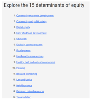
King County is a great place to live, learn, work, and play. But this is dependent on your race and where you live. King County is committed to addressing this inequity, so it has developed an Equity and Social Justice Plan. This outlines four major paths to making positive and transformative changes – invest where the needs are greatest, invest in employees, invest in community partnerships, and provide transparent and accountable leadership . To measure how these initiatives are working, King County identified 15 conditions, or determinants of equity, that each of us needs to thrive. These in turn use indicators to show a high level of understanding of these conditions, thus giving policymakers a better understanding of equity when making decisions.
In 2015, King County’s Office of Equity, Race, and Social Justice (OERSJ) developed The Determinants of Equity report to establish a baseline for this equity work . This report is deployed online as a lengthy .pdf document that users can browse to locate the information they need for planning, decision-making, and implantation of policies. However, finding this information in the report is not straightforward and the report is not easily updated with the most current data. So, the Office of Performance, Strategy, and Budget (PSB), which works with OERSJ, contacted us at the KCGIS Center for a different approach.
Cover of Determinants of Equity Report
PSB needed a way to inform policymakers, stakeholders, and the public about the determinants of equity and how successful King County is at removing barriers to making them accessible to everyone in the community. The solution needed to be interactive, easy to understand by laypeople, easily updated with the latest data or findings, and easy to maintain. After several conversations, we settled on utilizing Esri’s ArcGIS StoryMaps as the ideal solution.
StoryMaps is a product that is within Esri’s ArcGIS ecosystem. A StoryMap looks like a regular web page, but it doesn’t require the author to know any code. Rather, the author uses several tools to configure the StoryMap to meet their needs. Additionally, StoryMaps work well with other ArcGIS items such as Dashboards, Hosted Feature Services, Web Maps, and Instant Apps.
The first step in developing the StoryMap solution was describing the individual determinants of equity and the indicators that measured the success of each determinant. We decided to leverage StoryMap Collections. A StoryMap Collection is a group of StoryMaps that is presented cohesively. So, one story introduces the determinant of equity while the additional stories describe the indicators that measure that determinant. Each Collection has its URL that is easily embedded in web pages.

StoryMap Collection
Next, we gathered the data that is used in interactive maps and dashboards to clearly describe the indicators. There isn’t one magical data set for each indicator. King County recognizes that data is subjective and that several data sets can be used to describe an indicator. The methodology they used gathered input from policy experts and community groups and centered on finding data that incorporates intersectional identities, such as race with disability or LBGTQIA+, and can show trends over time. Also, they are interested in data that show communities that are affected by climate change, such as BIPOC communities and people living with disabilities. Finally, data that is already available is preferred as it is easily incorporated into the indicator’s StoryMap .

One component of Digital Equity is access to devices. King County chose to look at computers in the household as an indicator for this determinant – cell phones and tablets weren’t included.
To help with this data compilation, we used ArcGIS Notebooks. Since this type of work involves repetitive tasks, Notebooks allows us to automate these tasks programmatically using Python. Each Notebook saves the code, can create live links to data sources as necessary, and provides documentation for the data development. When it’s time for us to update the data, we can just rerun the Notebook after a few adjustments to the code.

Part of ArcGIS Notebook for Determinants of Equity
Once the data is developed, it is hosted in our ArcGIS Online portal. This allows the data to be viewed and used by individual users as well as in additional ArcGIS products like Dashboards and Web Maps. We use Dashboards to chart different iterations of the determinants of equity indicator information, and we use Web Maps to provide a spatial view of the data when location information is attached to it. The Dashboards use the same style from data set to data set. To easily copy this style, we used ArcGIS Assistant to duplicate the Dashboard and insert the new data source in the Dashboard’s JSON code. This way, the Dashboard configurations are preserved. Also, since Web Maps aren’t especially user-friendly on their own, we used them to develop Instant Apps to provide more accessible maps.

We also wanted to make sure the data sources for these Dashboards and Instant Apps are available to users. We discovered that while the determinants of equity data are shared with the public from ArcGIS Online, end users need to have an account on ArcGIS Online to view and download the data. Esri does offer these for free, but it’s not the workflow we want our users to experience. To make accessing this data barrier-free, we share it through an ArcGIS Hub Site. While the data is still hosted on ArcGIS Online, this Site allows users to interact with the data, download it, or even set up an API connection without having to establish an ArcGIS Online account.

Determinants of Equity Data Library is an ArcGIS Hub Site
Finally, all these components – narrative, images, Dashboards, Instant Apps, and links to the data on the Hub Site, are gathered into the individual determinant of equity indicator StoryMaps. Each indicator StoryMap is placed in the proper StoryMap Collection. These Collections are linked in OERSJ’s Determinants of Equity data tool website.
Part of the Determinants of Equity data tool website
PSB, in conjunction with OERSJ, determined that a web page managed by OERSJ is the best entry point for anyone interested in equity issues in King County. This site contains links to 15 Story Map Collections that house 64 StoryMaps, 91 data sets (hosted feature services), 262 Dashboards, and 47 Instant Apps. Additionally, 41 Notebooks were developed to automate data development. The website includes additional links to a user guide, determinants of equity data methodology, and summaries of community engagement.
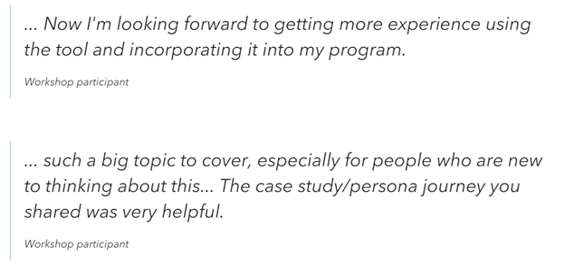
The Determinants of Equity data tool has been very successful. PSB is developing training sessions and resources so users can take full advantage of this tool. Users will learn about the different types of data, and things to consider when doing an equity analysis of a proposal and will run through real-world scenarios.

Example of Determinants of Equity data tool workshop materials
Sources for this article:
Equity and Social Justice Strategic Plan 2016 – 2022 Executive Summary
Highlights from the King County’s Equity and Social Justice Plan
Determinants of Equity data tool
Determinants of Equity Team:
Consuelo Norris, Determinants of Equity Project Manager, Office of Performance, Strategy and Budget
Alicia Brown, Solutions Architect, King County Information Technology
Mary Ullrich, GIS Specialist, King County GIS Center
Harkeerat Kang, GIS Engineer, King County GIS Center

Mary Ullrich is a GIS professional with over 24 years of experience in the industry. Her work has included GIS database design, analysis, mapping, and training curriculum development.
Among Mary’s particular areas of expertise are analysis and mapping of census data, developing web applications deployed on the ArcGIS Online platform, and coaching GIS users through the intricacies of GIS software.


