In the midst of primaries season for the 2018 national midterm and local elections in November—our own Washington primaries are less than a week away, on Tuesday, August 7—here’s some food for thought about elections-related maps, how they can be used and abused and what they can teach us about effective and valid cartographic design.
Among the fundamental skills required to be map literate, that is, to be able to read and comprehend maps, are an understanding of scale, the recognition of spatial orientation (north-south-east-west, up-down, etc.), and an appreciation of map projections (by which a three-dimensional surface is represented in two dimensions). A higher-level, overarching principle of map literacy is that a single map can seldom tell a whole story, which is a point well made by Dr. Kenneth Field, Esri senior cartographic product engineer, in a recent article in Wired.
In “Is the US Leaning Red or Blue? It All Depends on Your Map,” Field discusses a number of dramatically different maps that display voting data from the 2016 United States presidential election. Field avoids branding certain maps right or wrong (assuming the data in the maps are valid). Instead he explains how certain types of maps can emphasize a particular story, or how they can obscure or reveal specific aspects of the data they portray.
Understanding how maps can do these things is a necessary skill in being able to judge the validity of particular maps. A collection of various maps of the 2016 election could function as a wonderful laboratory for learning and exercising map literacy. As noted in the Wired article, Dr. Field has provided just such a learning laboratory with his interactive map gallery, “Thematic maps of the 2016 Presidential election (lower 48 states).” Perusing 32 different maps of the election results and their explanations should help anyone better understand any one map of election results, past or future.
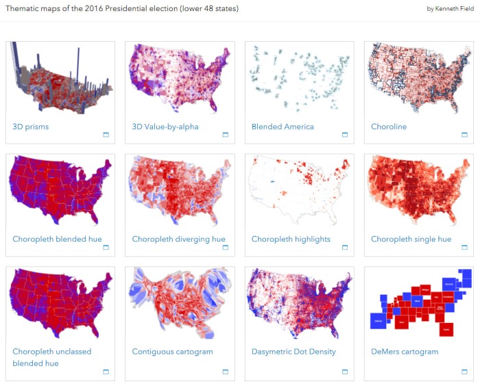
Some of the maps in the gallery “Thematic maps of the 2016 Presidential election (lower 48 states)” by Kenneth Field.
Dr. Field goes by the Esri username “cartogeek,” but he also blogs under his own “cartonerd” label. On the same day the Wired article was published, Field drilled down in his blog on yet another 2016 election map which appeared recently in the New York Times. The result is a highly acerbic and instructive case study in map literacy. We would all do well to use examples like these, and the insights of professional cartographers like Kenneth Field, to heighten our awareness of how maps can represent, and misrepresent, data. When it comes to elections data, that can’t help but make us more informed and better citizens.
Patrick Jankanish is Senior Cartographer in the King County GIS Center and is a member of its Client Services group.


Three cheers for pushing Kenneth Fields carto wisdom out to a wider audience.
LikeLiked by 1 person
Pingback: NSGIC publishes best practices guidance to improve elections with GIS | GIS & You